DESIGNING A LUXURY PENTHOUSE - PART 1
THE FIRST LOOK - TOURING THE EXISTING SPACE
WE HAD NO IDEA …
When we were called in to just casually look at a Condo Layout that our clients had recently purchased little did we know that it would turn into this spectacular Luxury Kitchen that it is today. We had no idea that the pink walls, dated look, ordinary layout would turn out to be this sparkling jewel of a functional but beautiful kitchen.
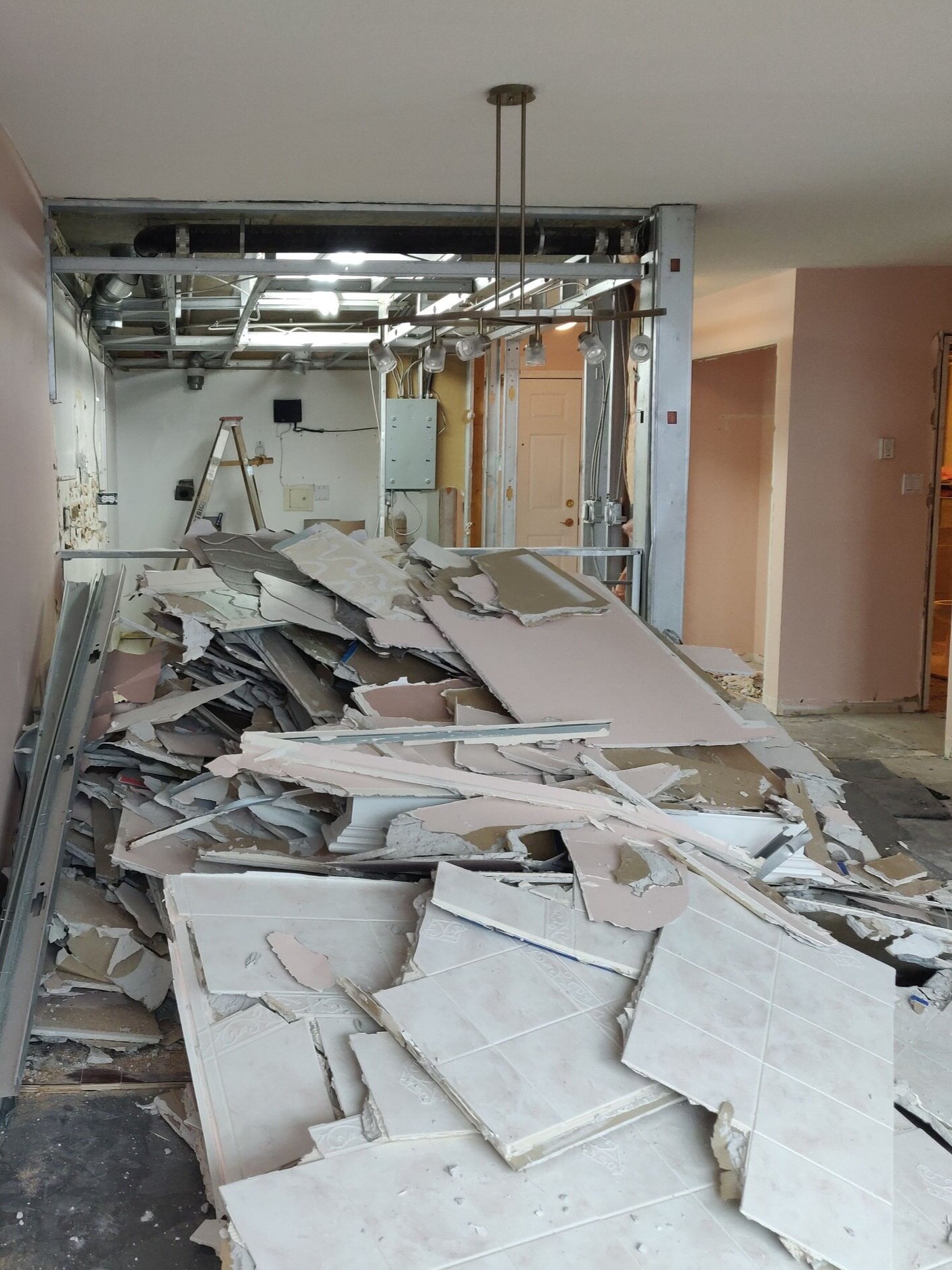
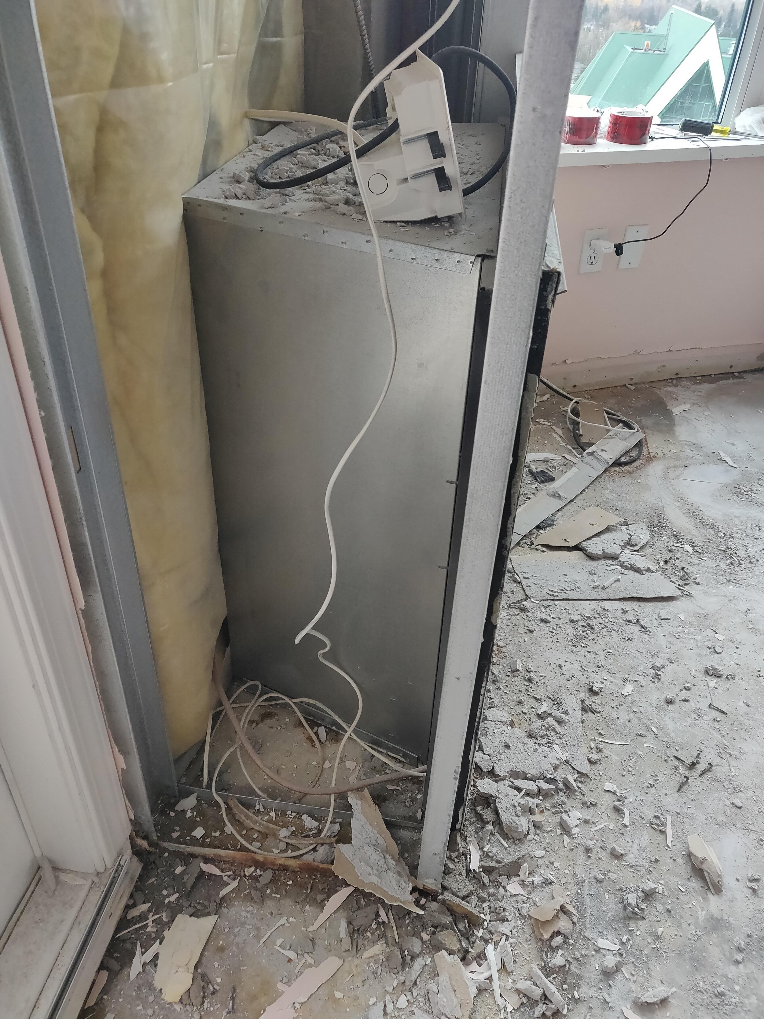
The elevator took us up to the very top of the tower up onto the 24th floor. As we entered the front door we were greeted with tons of drywall parts and pink & white dust and after we stepped over all the rubble what caught our attention was the sweeping views of the City that lay below, the tope of other buildings nearby and further on the eye went to the spectacular view of the Mountains, Vancouver Island in the distance and the glistening but faded sparkle of the ocean that separated the mainland! To the left was the door to the breezy patio and then lo & behold to the left there was Mount Baker in all its glory!!
THE DESIGN PROCESS STARTS WAY BEFORE PEN IS PUT TO PAPER
As we toured the rooms we realized that the clients have already started the process of renovation since everything was torn down. That made us think well the clients might already have something that they have thought out for the place and how they want to do it. And while they showed us the different rooms they pointed out few features that they wanted to keep and some they wanted to change slightly and then some they wanted a complete change.
It was challenging but our creative mind was already churning, wheels in our head were turning!! We were up for it!
Existing Layout of the Condo | Reena Venkatesh, Designer
Above was the existing floor layout. Notice that 5 main things stood out:
Kitchen was closed in with a pocket door, with Laundry and Pantry in a back room with no direct access
There was no separate Dining room and Living Room was also tucked away to one corner near the window
The Hall Bath was much smaller with very little storage
The Den/Bedroom had potential more than existing with a Hall closet that was tiny and not practical
The **Main Bedroom Ensuite had a walk-in closet area but the closets was wasted space in the corner
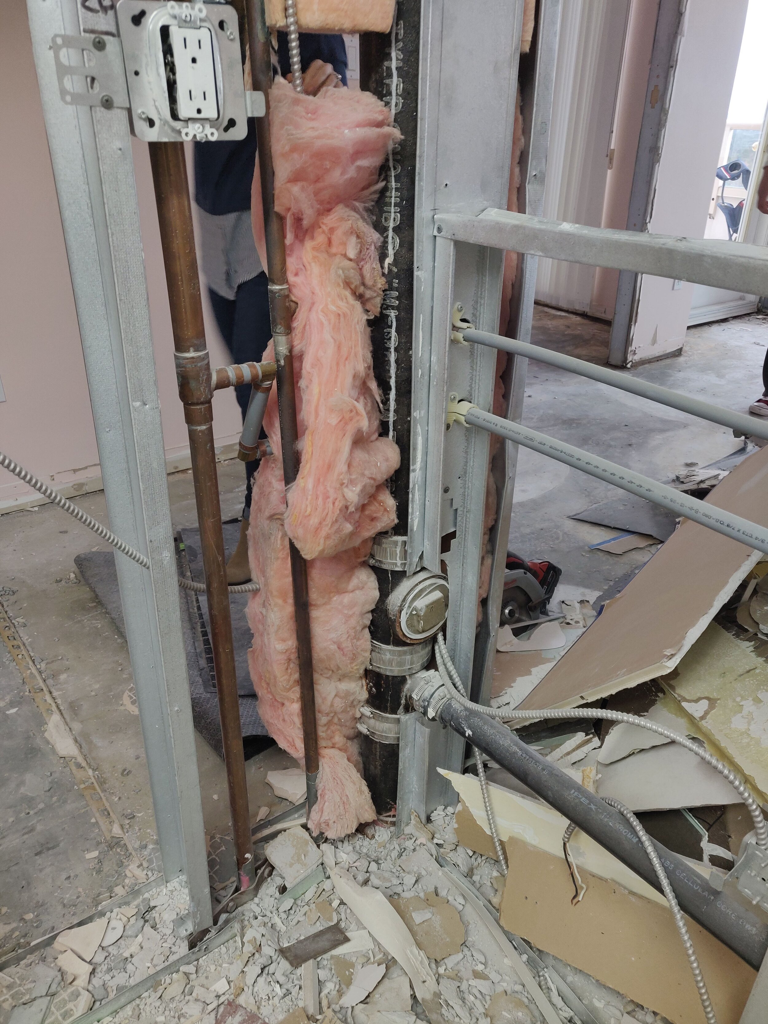
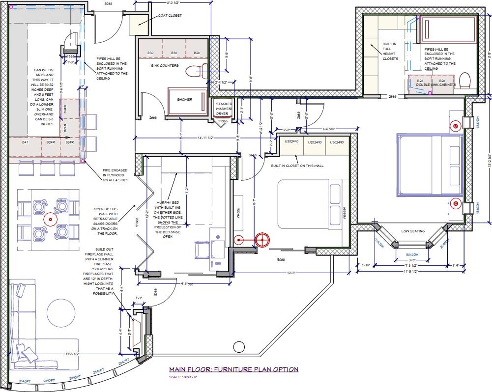
So we decided to do some changes to the floor plan that was more practical and would work towards the benefit of the whole condo. Walls needed to go, New enclosures needed to be created with changes plumbing & electrical. Below are few closeup snapshots of the First Draft.
Proposed First Draft with Plumbing changes Reena Venkatesh, Designer
Proposed First Draft - Cabinet & Furniture Layout Reena Venkatesh, Designer
HERE IS A BREAKDOWN OF WHAT NEEDS TO STAY, WHAT NEEDS TO GO:
TO STAY:
The kitchen location stays AS IS along with the location of the Cooking Range & Exhaust Fan.
The Fireplace Location stays with lots of improvements
The Hall Bathroom Plumbing fixture location stays - Shower, Toilet, Sink
The **Main Ensuite Bath Plumbing Fixture location stays - Shower, Toilet, Sink
All external windows stay AS IS, no changes needed
All external doors stays as is (doors to the Patio & Entry door) as far as position and location goes.
Room location for Living, Bedroom/Den, Main Bedroom, Hall Bath, **Main Ensuite, Hallway, Kitchen stays same.
TO GO:
Existing Laundry and wire rack Pantry to go - new spot for Laundry closer to bathrooms & New Pantry, a more practical approach, more organized storage and Create MORE storage!
Wall between kitchen and hallway & between kitchen & dining to completely go. It will totally opened up to create open plan, more space, more natural light
Ceiling dated boxed lighting to completely go away and ceiling raised with new lighting
Existing nook area to go away giving more room to bring in a functional kitchen
Existing 3rd bedroom to go making room for new Dining area
Some Proposed Space Planning Layouts of the Kitchen & Pantry
Reena Venkatesh, Designer
In this Kitchen Layout we were still working out the specifics and wanted to make sure that the shape of the layout was desired
Reena Venkatesh, Designer
In this Kitchen Layout we proposed an angular entry walk-in Pantry. Refrigerator was tucked in to the right. Peninsula proposed instead of island.
Reena Venkatesh, Designer
In this Kitchen Layout we proposed an Island with seating & counterspace. Notice Sink stayed in original location, so did Refrigerator. Far wall was Pantry.
Reena Venkatesh, Designer
In this Kitchen Layout we proposed Island with Sink & Dishwasher in it. Refrigerator was tucked in the corner. Pantry was a walk-in. Wall oven moved to center.
BREAKDOWN OF WHAT NEEDS TO TRANSFORM, WHAT NEEDS TO BE RELOCATED:
TO TRANSFORM:
Kitchen
Create an open concept Layout with easy access to all areas of the kitchen
Create tons of storage of different configurations - deep storage, shelf storage, pull out storage
Change location of sink and faucet and create storage under (avoid waste of space)
Change location of Refrigerator so when in use doors do not cut into Kitchen work area
Take out all overhead cabinets that closes in the kitchen and open up the space
Improve the Lighting layout with different kinds of lighting for different tasks
Fireplace & Living Room
Change the Fireplace look by getting rid of traditional mantle
Extending the Fireplace to cover the full wall including the patio door
Raise the new fireplace off the ground and bring in a super efficient fireplace
Transform the fireplace wall into a Statement Focal Wall
Eliminating the current Dining Nook so Kitchen Counters can be extended up to it
Bedroom 3/Den
Eliminating the wall between this room and the Living Room
Initially the idea was to have this as a Flex/Guest room - So have floor to ceiling glass partition that can be opened up when company over with some privacy glass when used as Guest room
Creating Focal wall on the far wall facing the Living room & use Patio Sliding Door to enter Patio
Later on after discussions it was decided that this room will be the future Dining Room with a ceiling chandelier
Hall Bath
Improve the shower space and enlarge it with seamless glass walls and door
Increase storage in the bath with a bigger vanity and pull out cabinets as well as a medicine cabinet
Making the bathroom look spacious with better space planning
Improve lighting layout with different kinds of lighting for different tasks
Main Ensuite Bath/Walk-In Closet
Open up smaller individual closets to make a complete built in closet with different kinds of storage
Create areas for different kind of hanging mode for clothes with full mirror, shoes & accessories shelves
Transform **Main Bath into a luxurious space with upgraded material finish,
Make shower surround into a focal wall and wrap the same material around with seamless glass wall partition
Improve storage in the vanity area with better lighting and cabinetry and stylish plumbing fixtures
Clean up ceiling existing vents and plumbing lines, add lighting and raise ceiling where possible to add height
TO RELOCATE:
Laundry to move from behind Kitchen into its own closet in the Hallway close to Bedrooms
Electrical Panel to be relocated from previous pantry to **Main Bedroom, behind door
Sprinklers locations will all be assessed with the new layout with a New Sprinkler Permit
Kitchen plumbing lines will all be redesigned and relocated with a New Plumbing Permit
So far we came up with all the Preliminary areas Clients needed changed and we would be coming up with new ideas and transform the layout to make it lots more functional.
Tune into the next part of this project planning and see what ideas we came up with, what new changes we bring in and how we weaved all the exciting ideas into the Schematic Design & Preliminary Sketches. Its gonna be exciting!
SNEAK PEAK OF THE DESIGN STYLE, COLORS & FINISHES INSPIRATION
As we were exploring the planning of the floor layout we also collaborated on a Pinterest Board and visited some local suppliers for inspiration on the different Colors & Material Finishes we wanted to incorporate in the space. We narrowed down some inspiration pictures, styles & looks.
Inspiration Board from Pinterest and other places - This gives an overall picture!
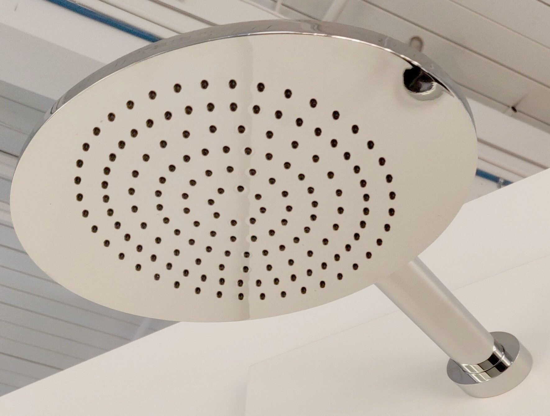
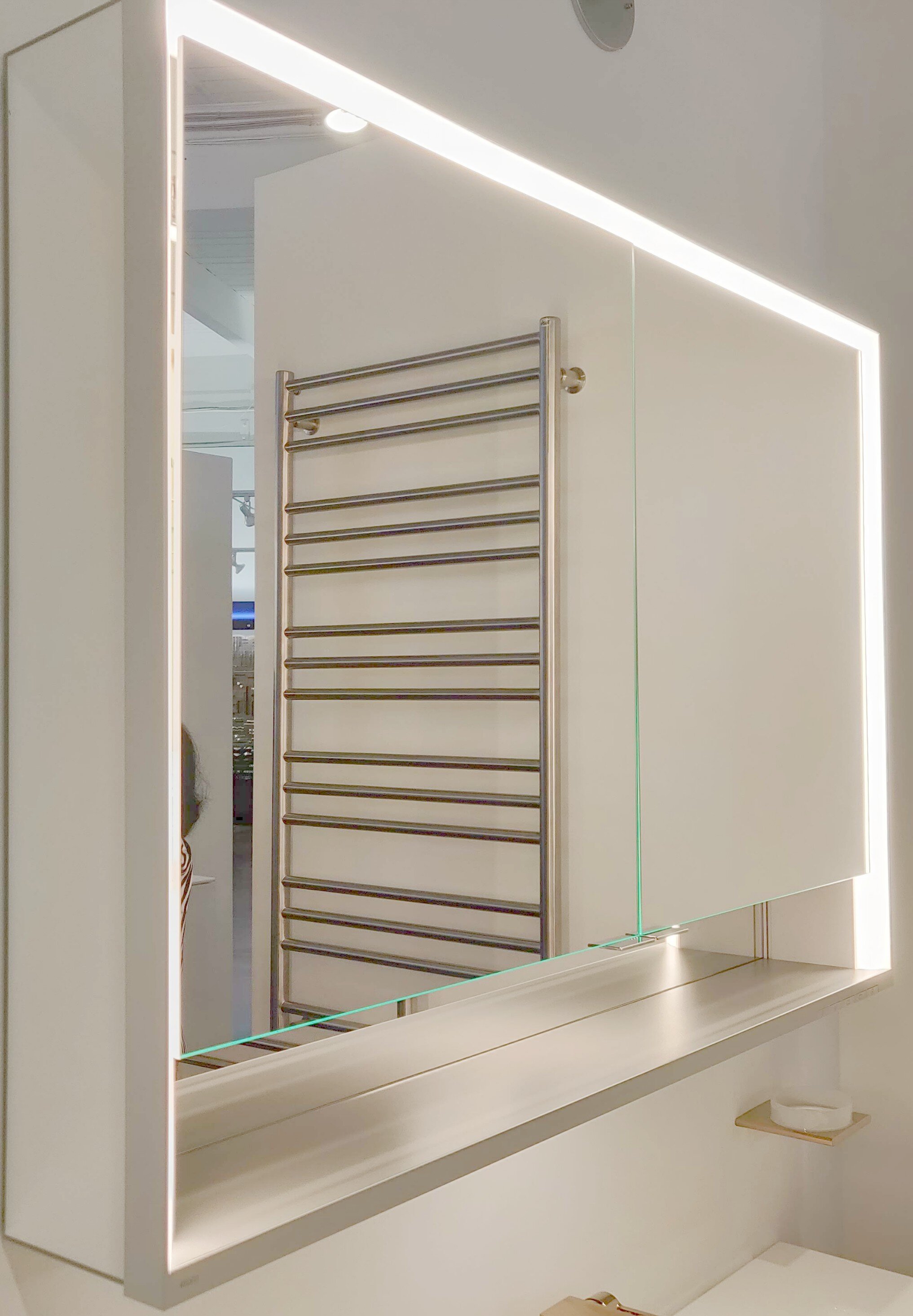
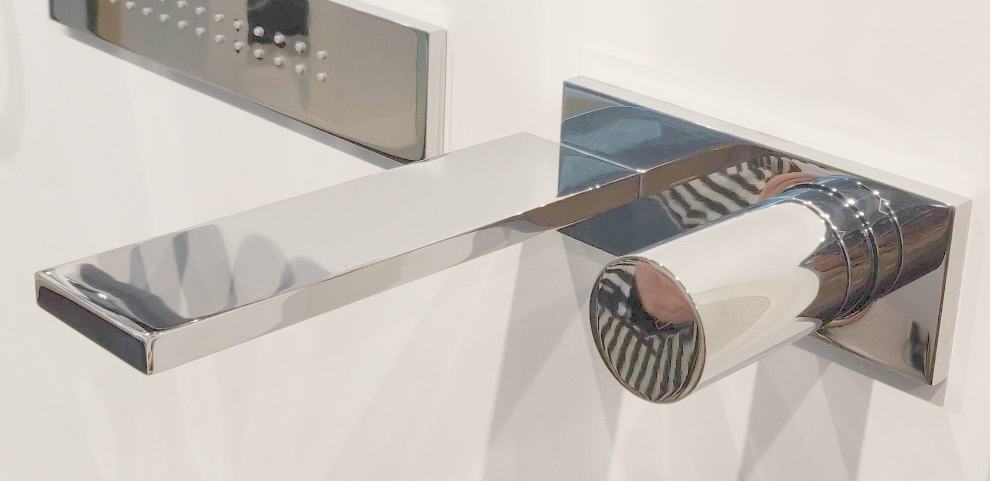
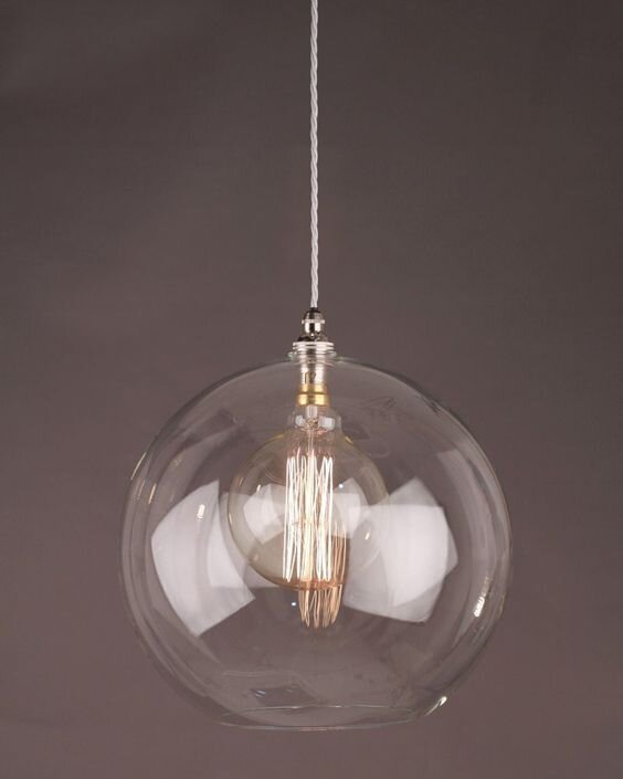
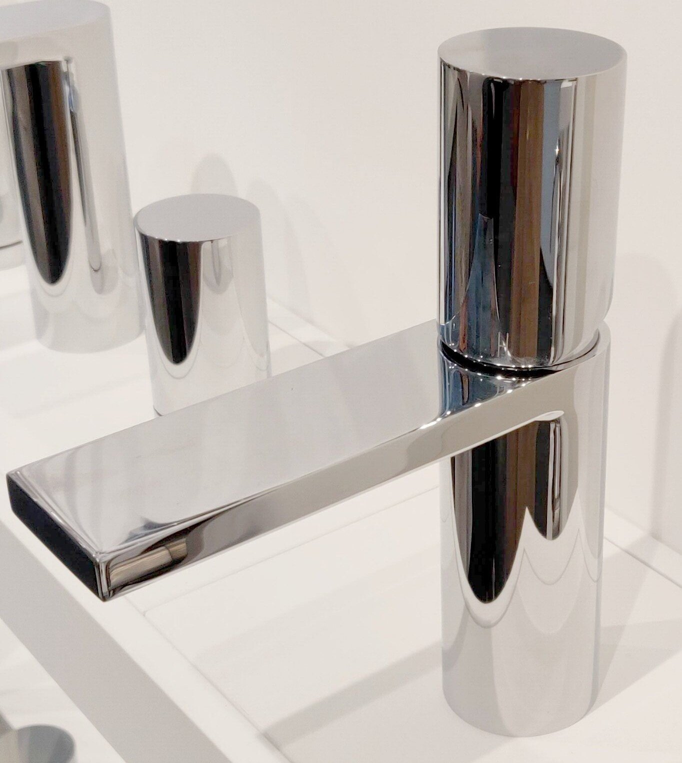
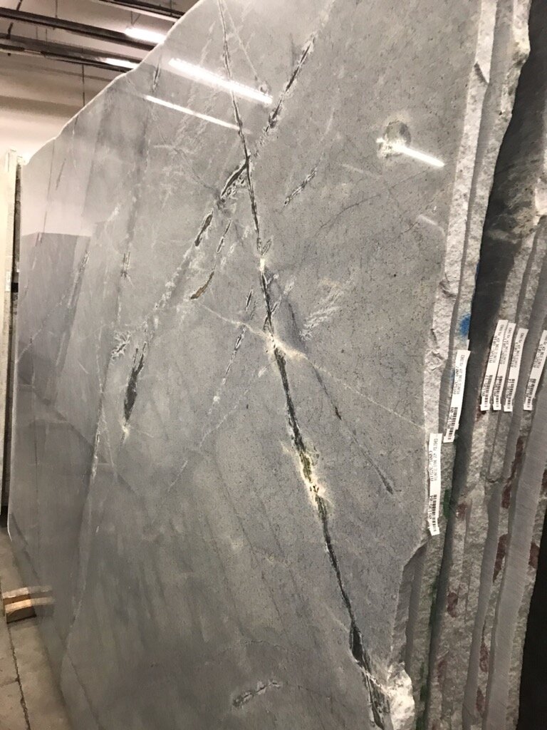
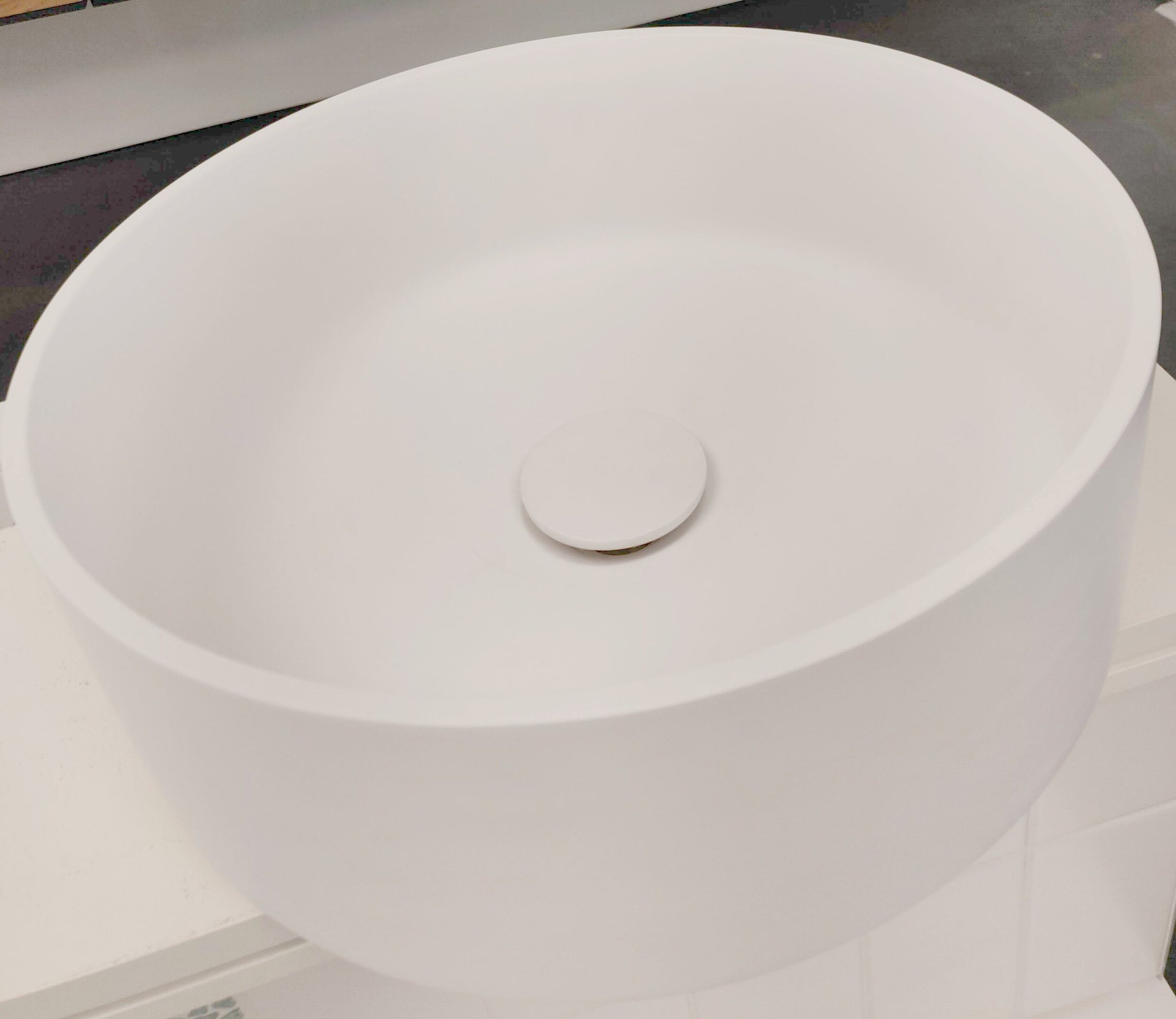
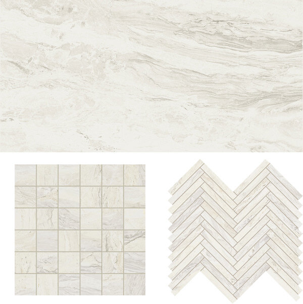
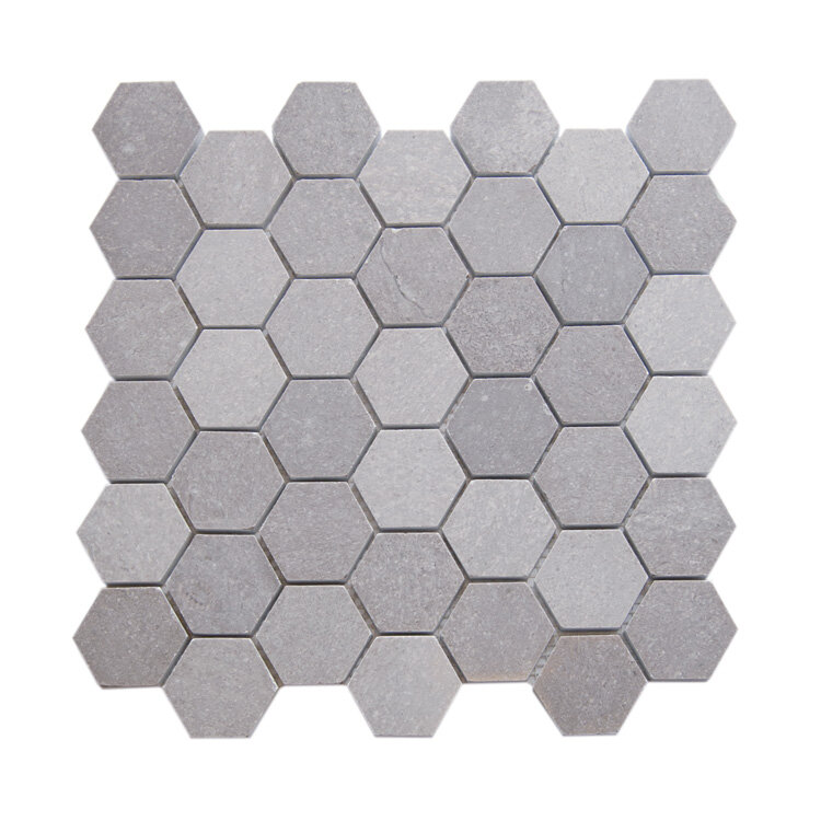
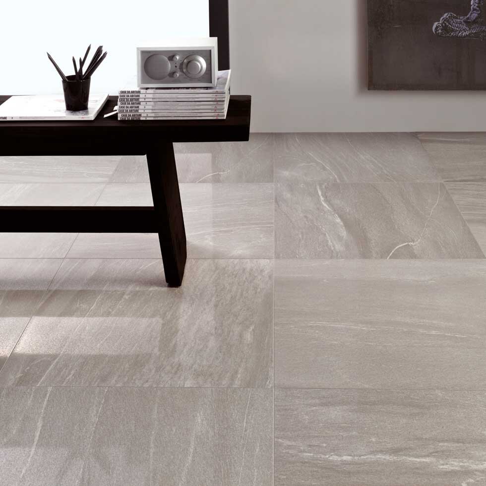
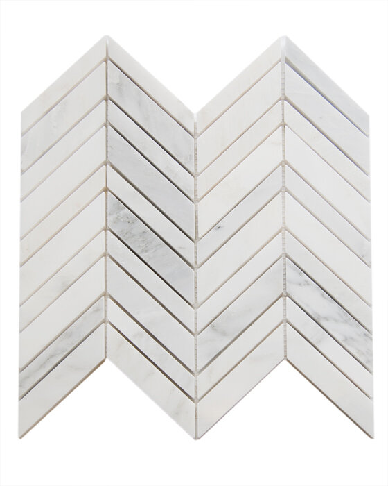
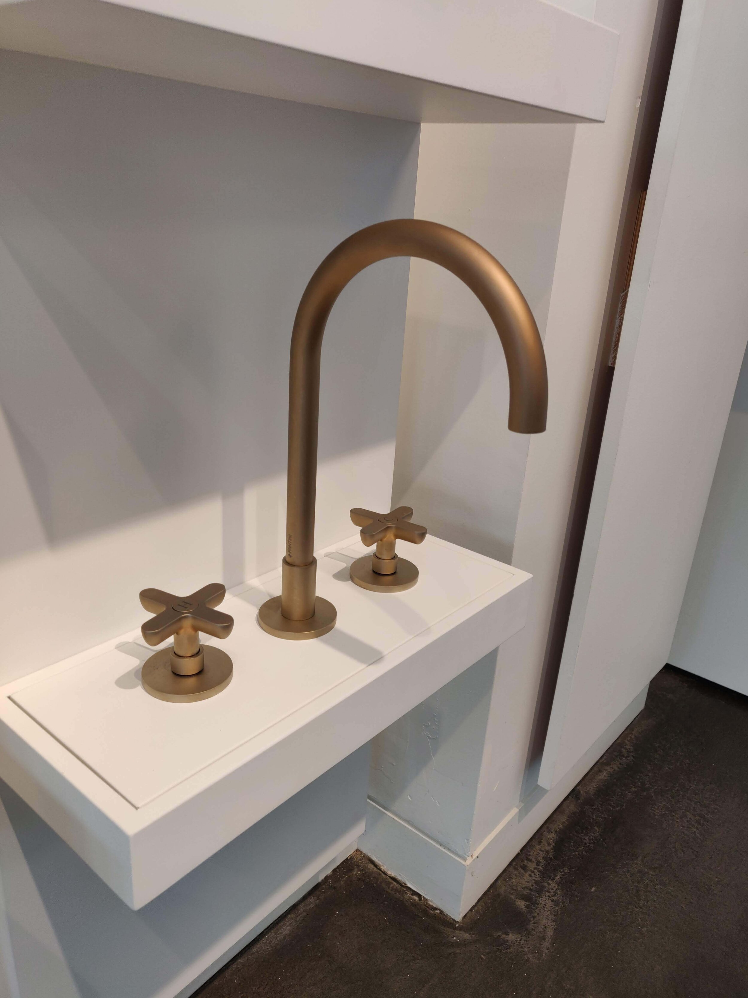
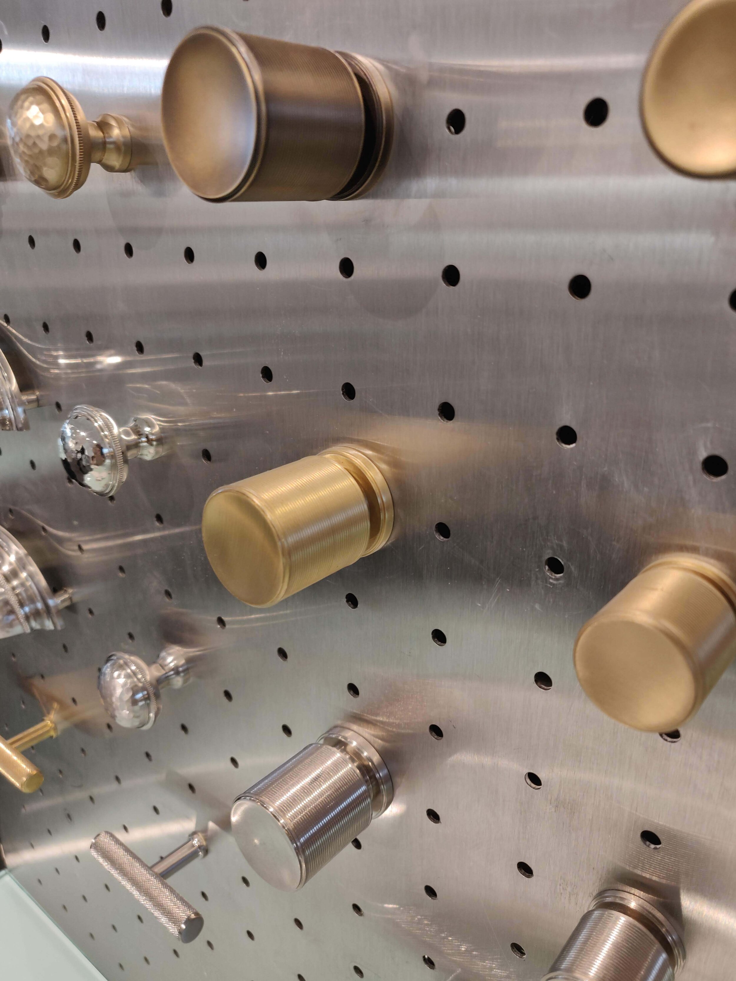
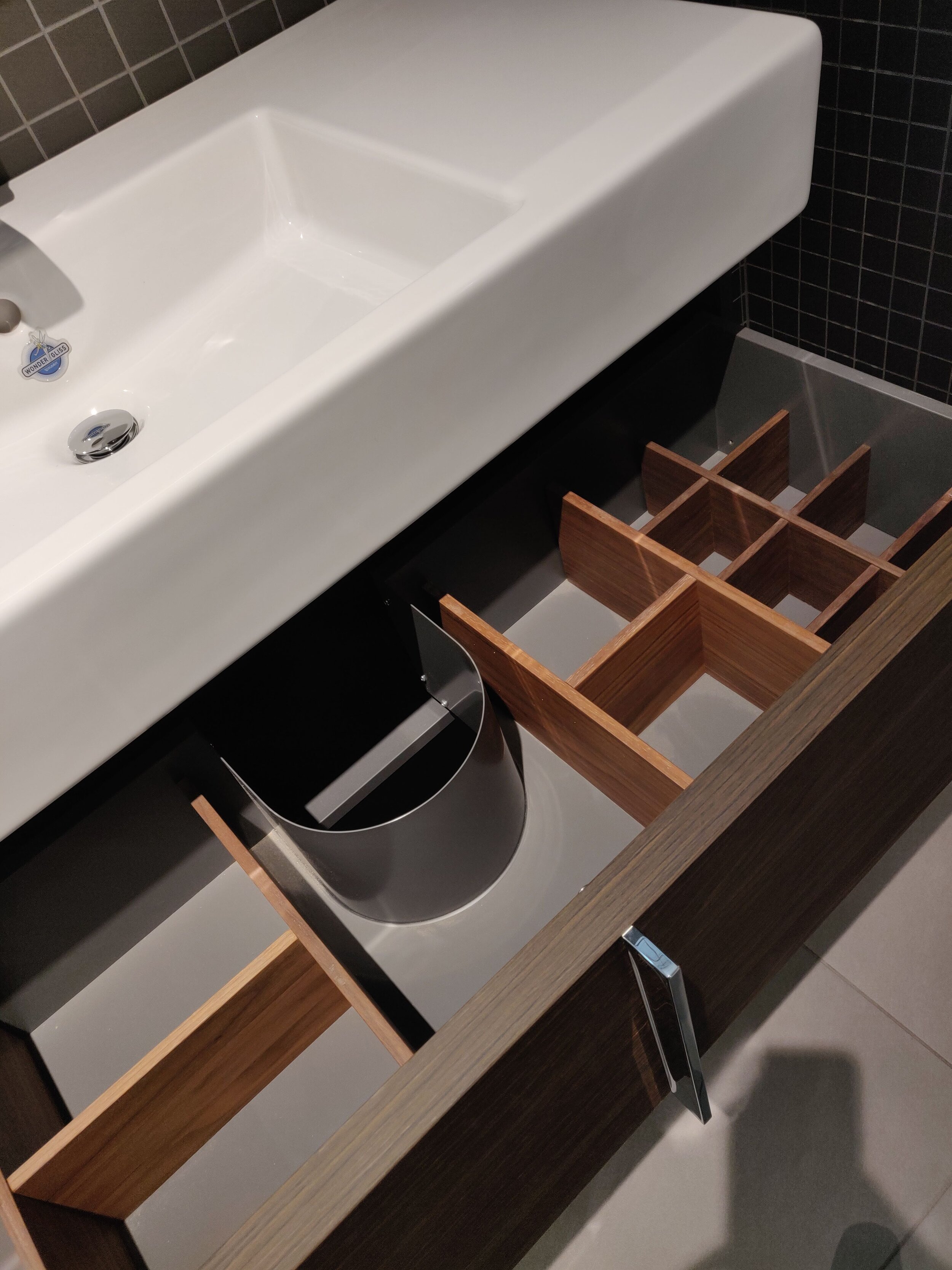
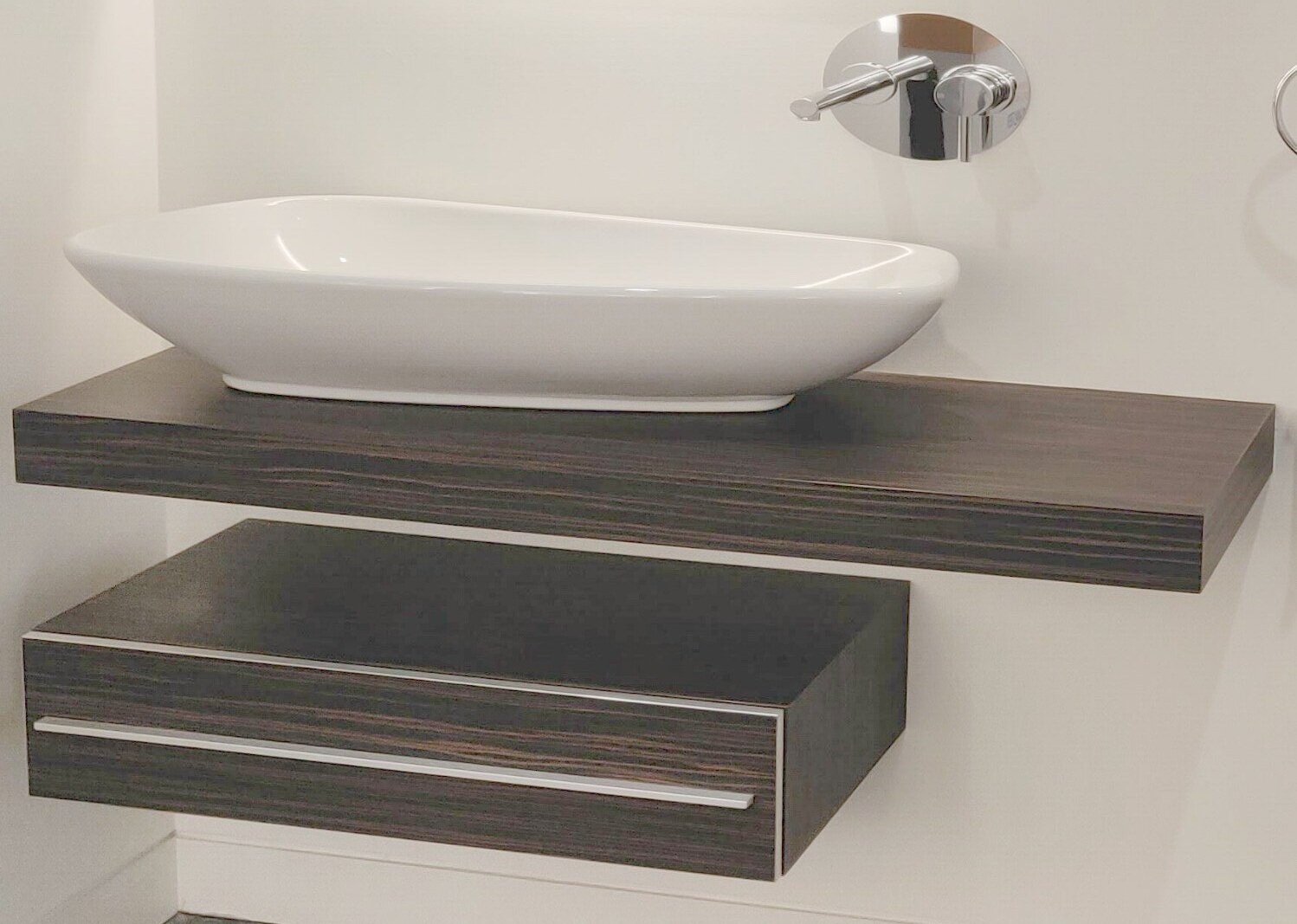
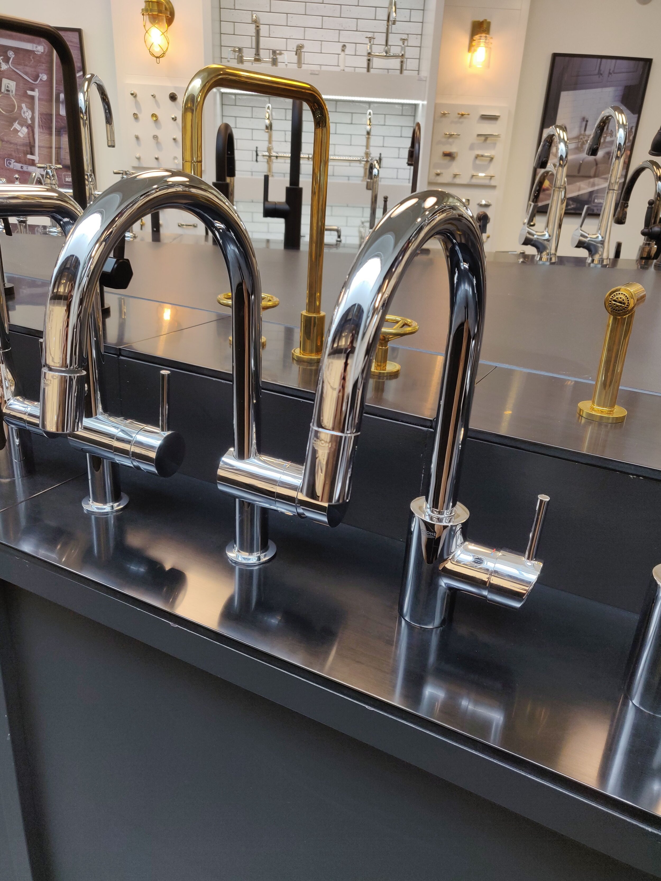
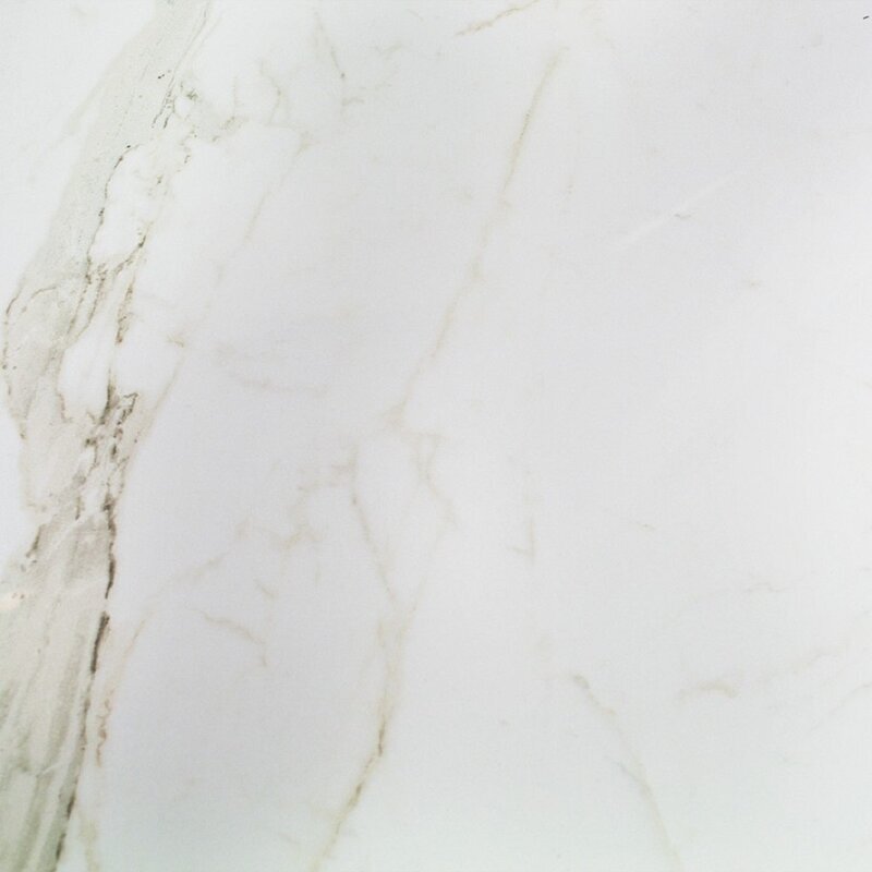
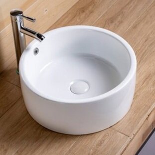
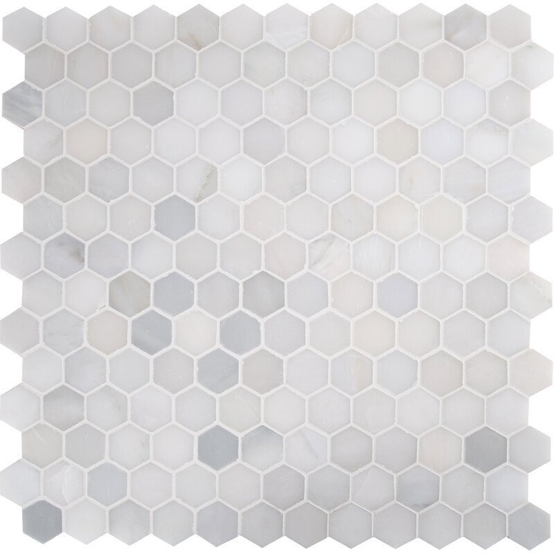
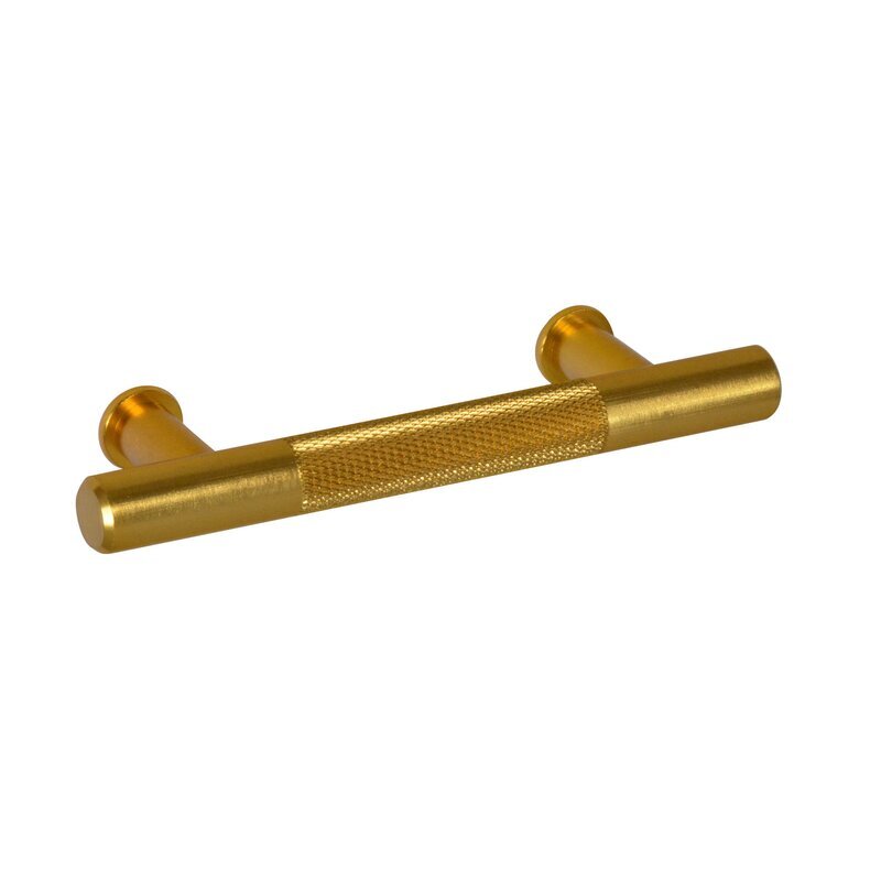
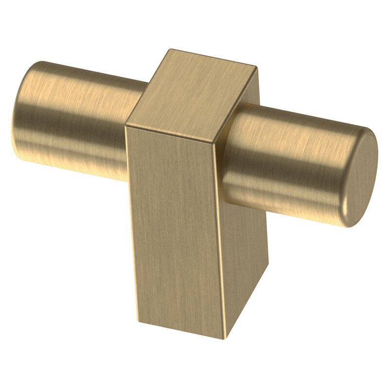
We went around town clicking pictures of plumbing fixtures, Countertop Stone, Floor Tiles, Wall Mosaic, Sink, Pulls! We had a blast exploring them and imagining the possibilities.
*****(TIP: When you are not sure what you really want and what the end picture will look like click & collect whatever catches your eye. You can always Edit later on!!)
A varied collection of finishes and products that we pulled out to get the process started!
A Conglomeration of colors, patterns, materials, shapes and the general direction we were heading towards can be seen in the above Collage. We wanted to bring in different shapes and saturation of neutrals to create Elegance
FEW THINGS WERE HAPPENING AT THIS POINT:
We were doing great so far and now crystalizing our thoughts to put together some Mood Boards.
We were done with all our research and now it was time to move ahead
Our Space Planning was coming along nicely and we were already preparing some 3D Illustrations
Slowly & Surely the Designs were coming to LIFE!!!!
“This PROJECT STORY of the Luxury Penthouse continues in the next Blog Post coming up when things get very exciting!! Please TUNE in to join us and see how we develop the Design and bring it to fruition”
SOME LUXURY VIBES THAT YOU MAY BRING TO YOUR HOME
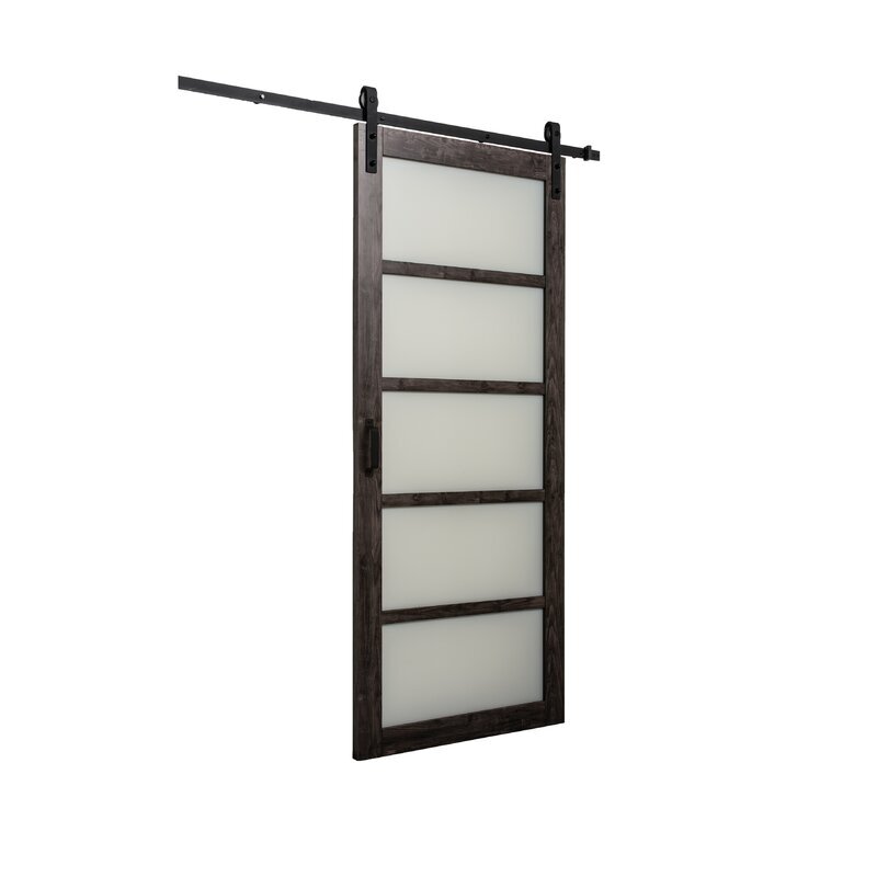
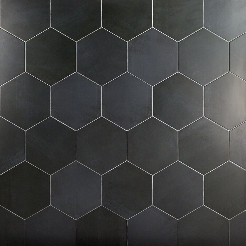
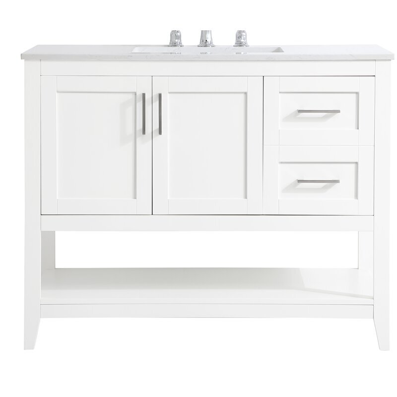
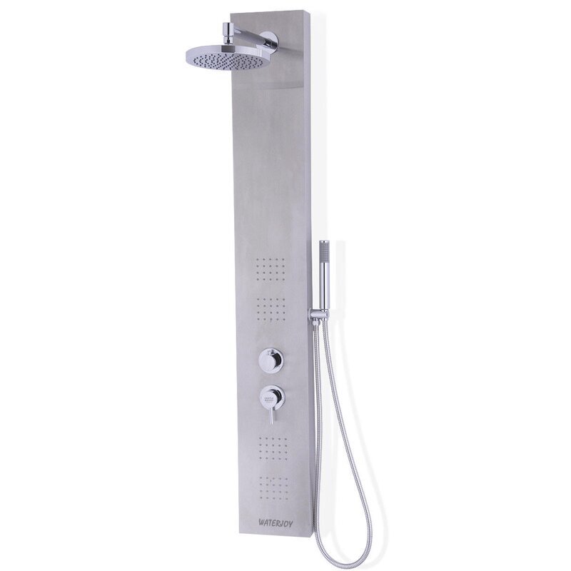
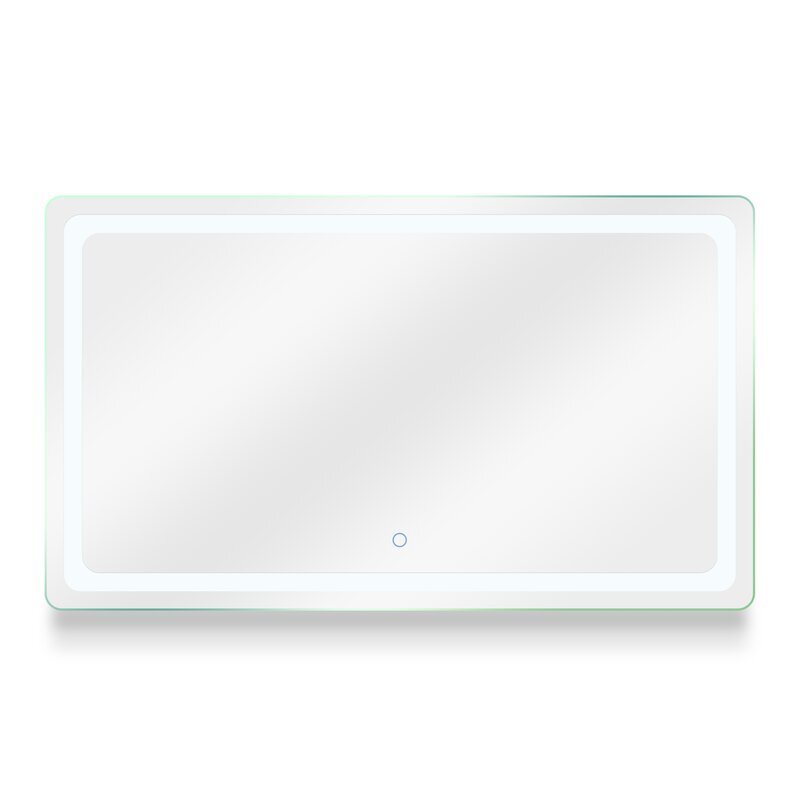
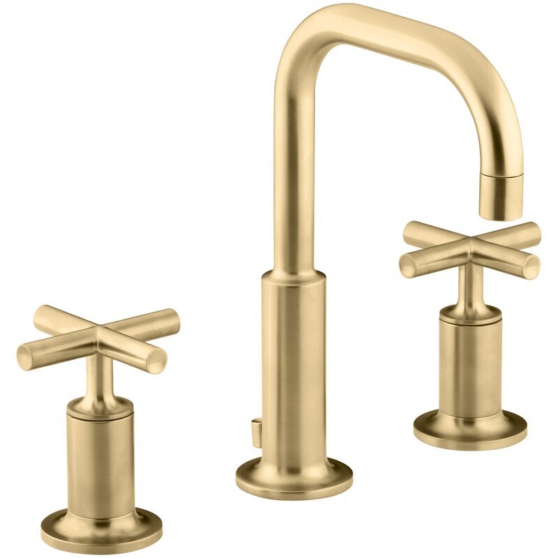
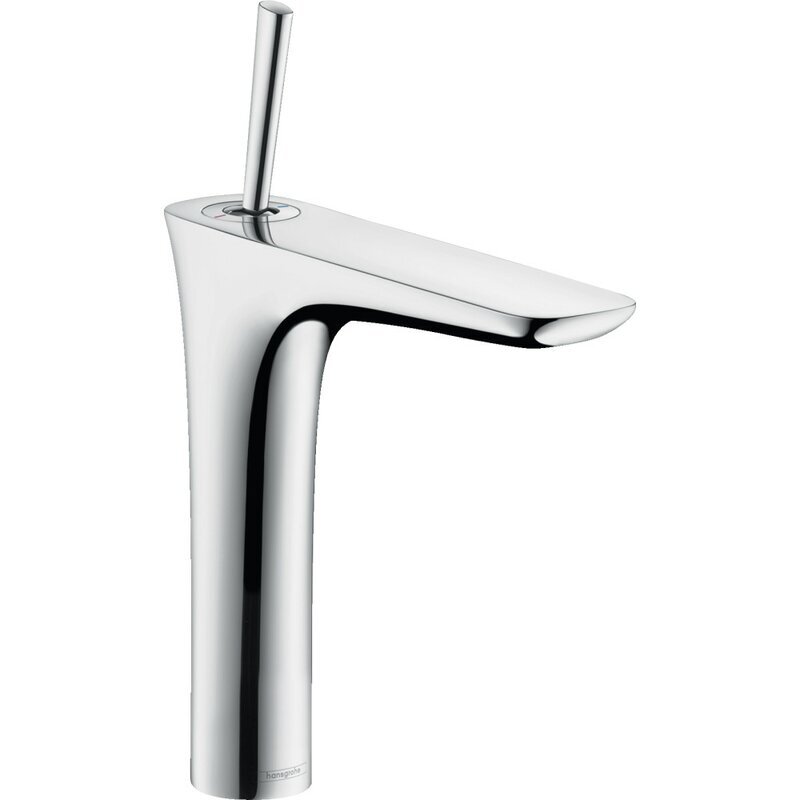
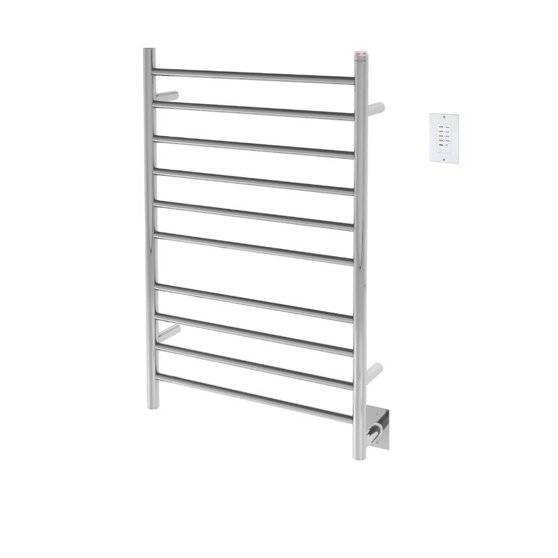
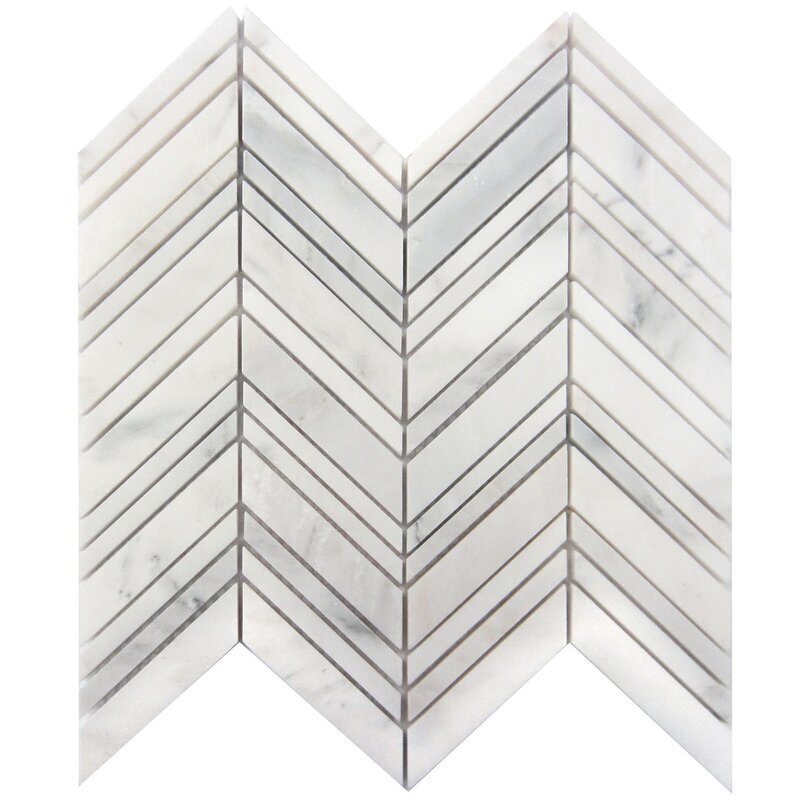
Even though we have sourced products for this Luxury Penthouse locally you can bring this kind of look for your home below
The items below contain affiliate links. Any purchases, at no additional charge to you, are most appreciated and make this blog possible.
Luxury Contemporary Mood Board
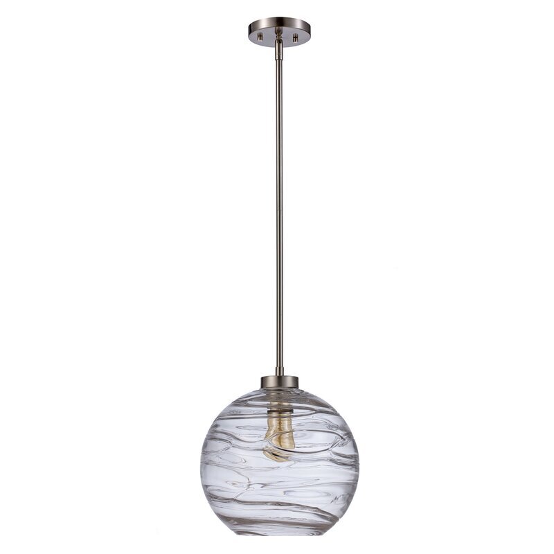
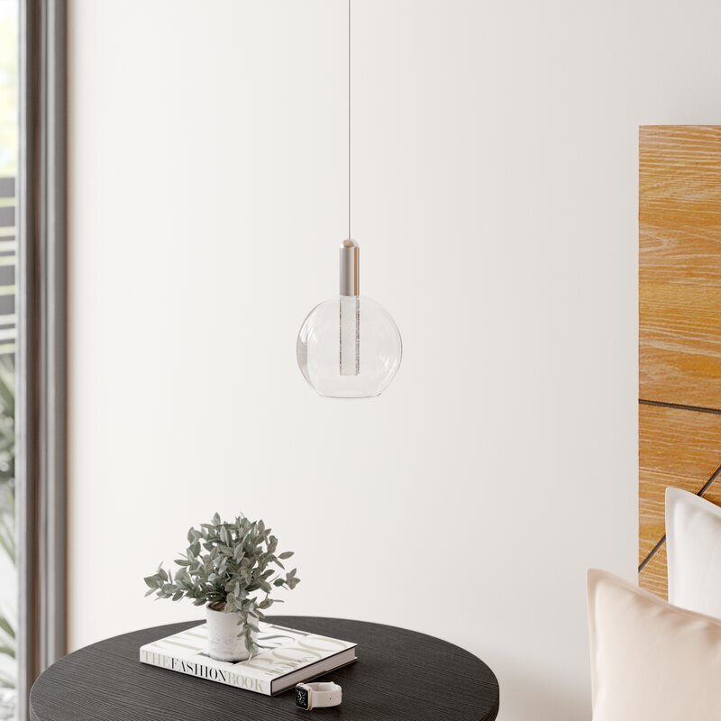
Shopping List - click on images to shop
**PLEASE NOTE: We are omitting the word “Master Bedroom” OR “Master Ensuite” and using “Main Bedroom” OR “Main Ensuite”.
We like respect of the Genders and Equal Rights for all. So hence any word that suggests otherwise will be omitted from our Vocabulary!
Disclaimer: This page may include affiliate links. Please read our disclosure for more information.
